Project 04 / 07
Topspin Tennis Club
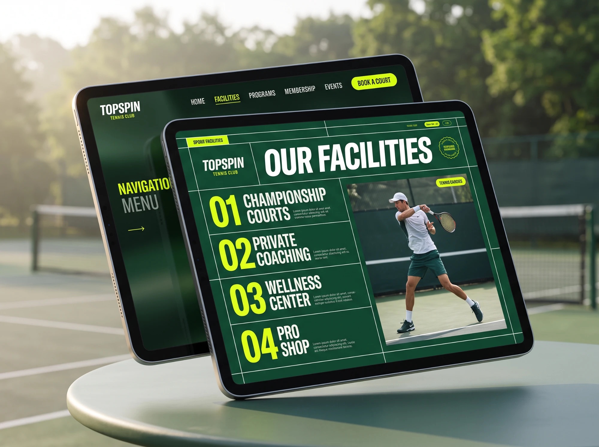
- Client
- Topspin Tennis Club
- Category
- Club website · Membership
- Services
- UI/UX, Web design, Colour system
- Stack
- HTML, CSS, JS
- Year
- 2026
A members’ website for a tennis club: book a court, join the club, see what’s on. Designed from the court up.
(Brief)
Club sites read like brochures. Members wanted to book a court in a few taps; new players wanted to know why this club.
(Solution)
Take the colours straight off the court: a green ground, white lines for structure, and ball yellow only where you act.
(01) — Colour
The palette is the court
- Court Green · the ground
- Line White · the structure
- Ball Yellow · the action
Court
-
Court Green#14432F55%
The hard court itself: the ground every page stands on.55% · Backgrounds, sections
-
Deep Green#0F2C1F15%
The shade along the baseline: footers, overlays, the night hero.15% · Footers, overlays
Lines & ball
-
Line White#FFFFFF22%
The chalk lines: every rule, frame and divider is a court line.22% · Type, lines, frames
-
Ball Yellow#D9FB1A8%
The ball. Only where you act: Book a court, Apply, Register.8% · Buttons, numbers, tags
Pill length = share of each page
- 01One ball per screen
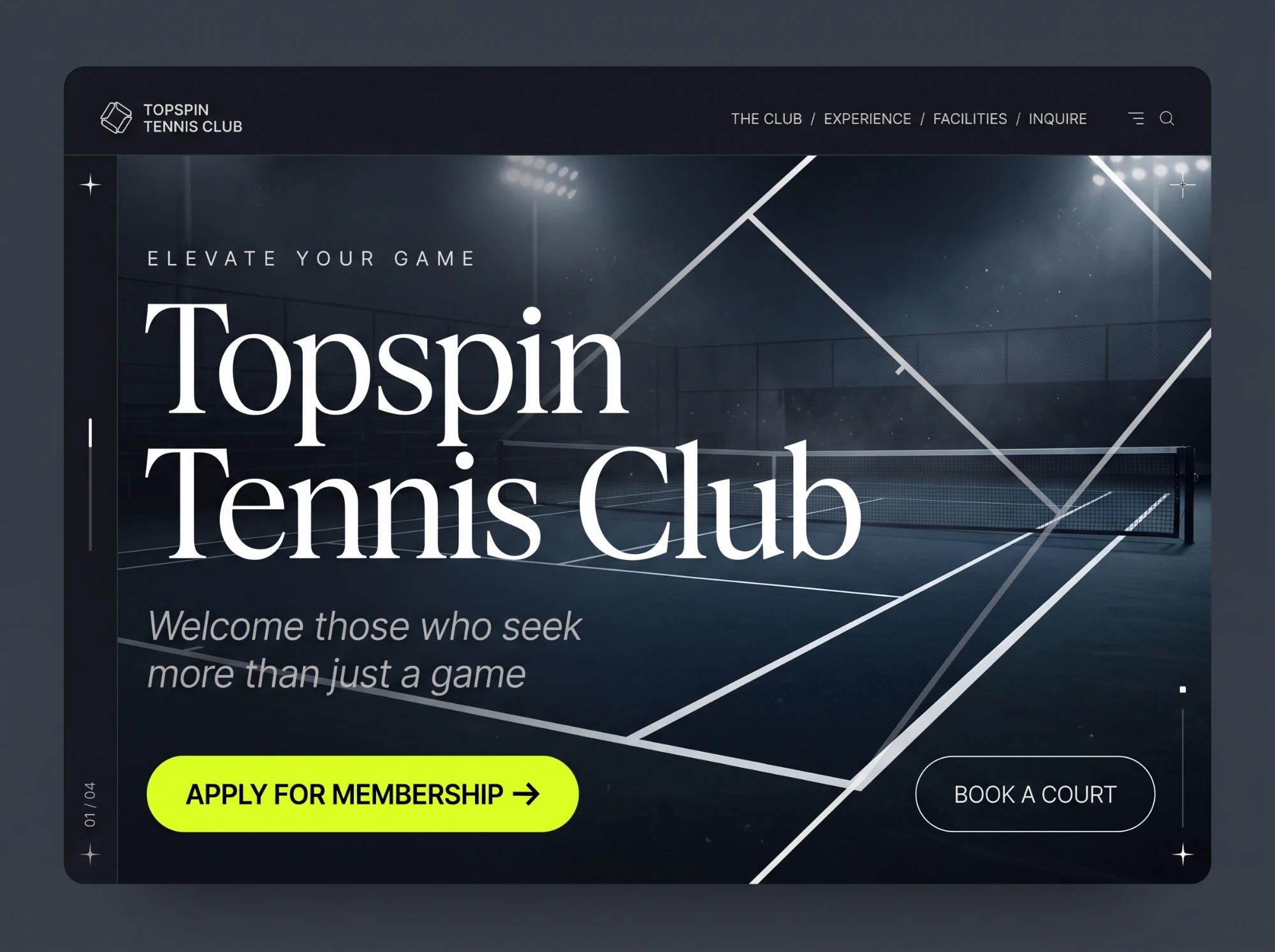
Yellow marks the single thing to do next: book, apply, register.
- 02Lines, not boxes
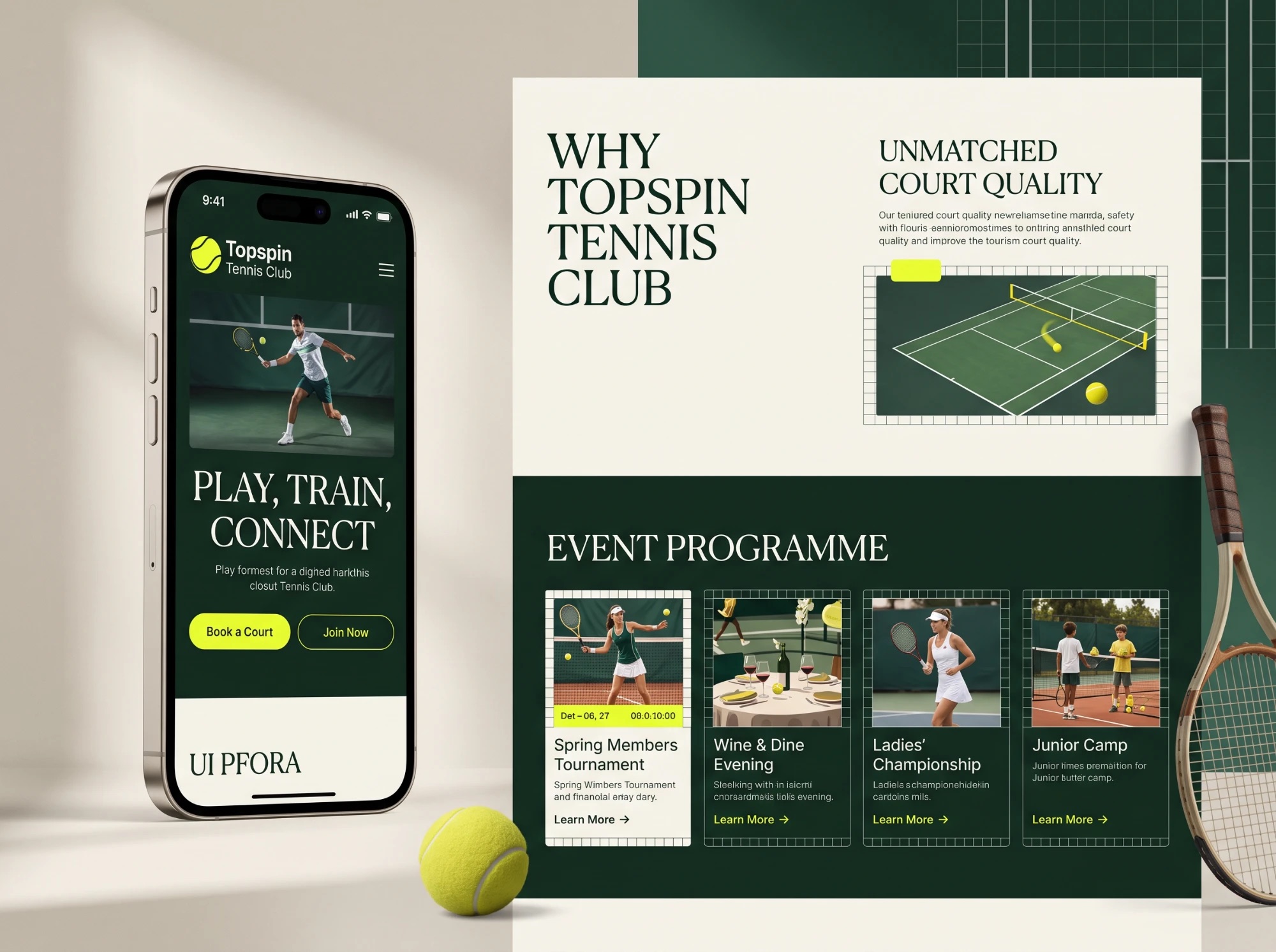
Sections are framed by white court lines instead of cards and shadows.
- 03Green carries the type
Headlines sit white on green; yellow numbers pick out the order.
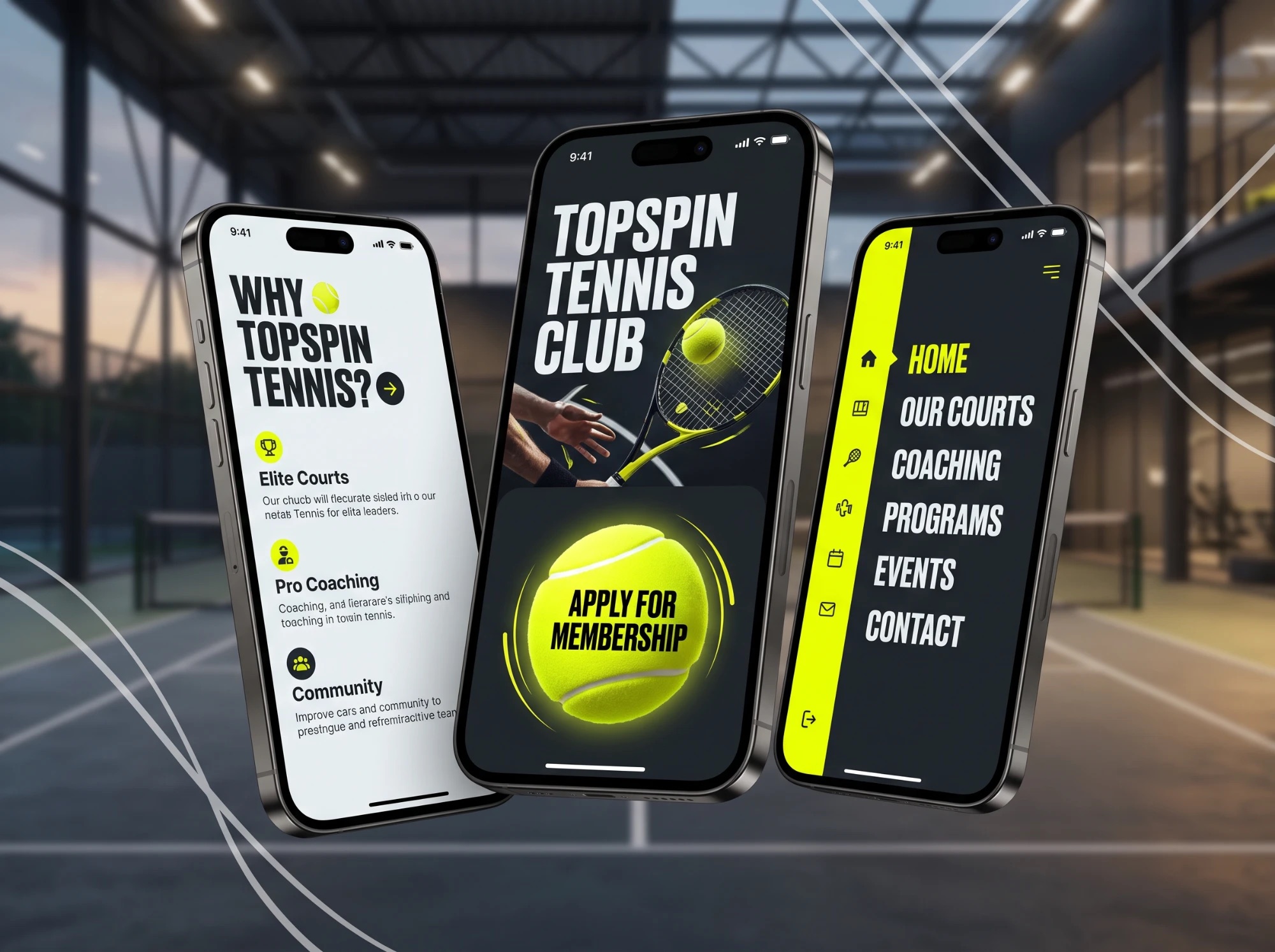
(02) — The final output
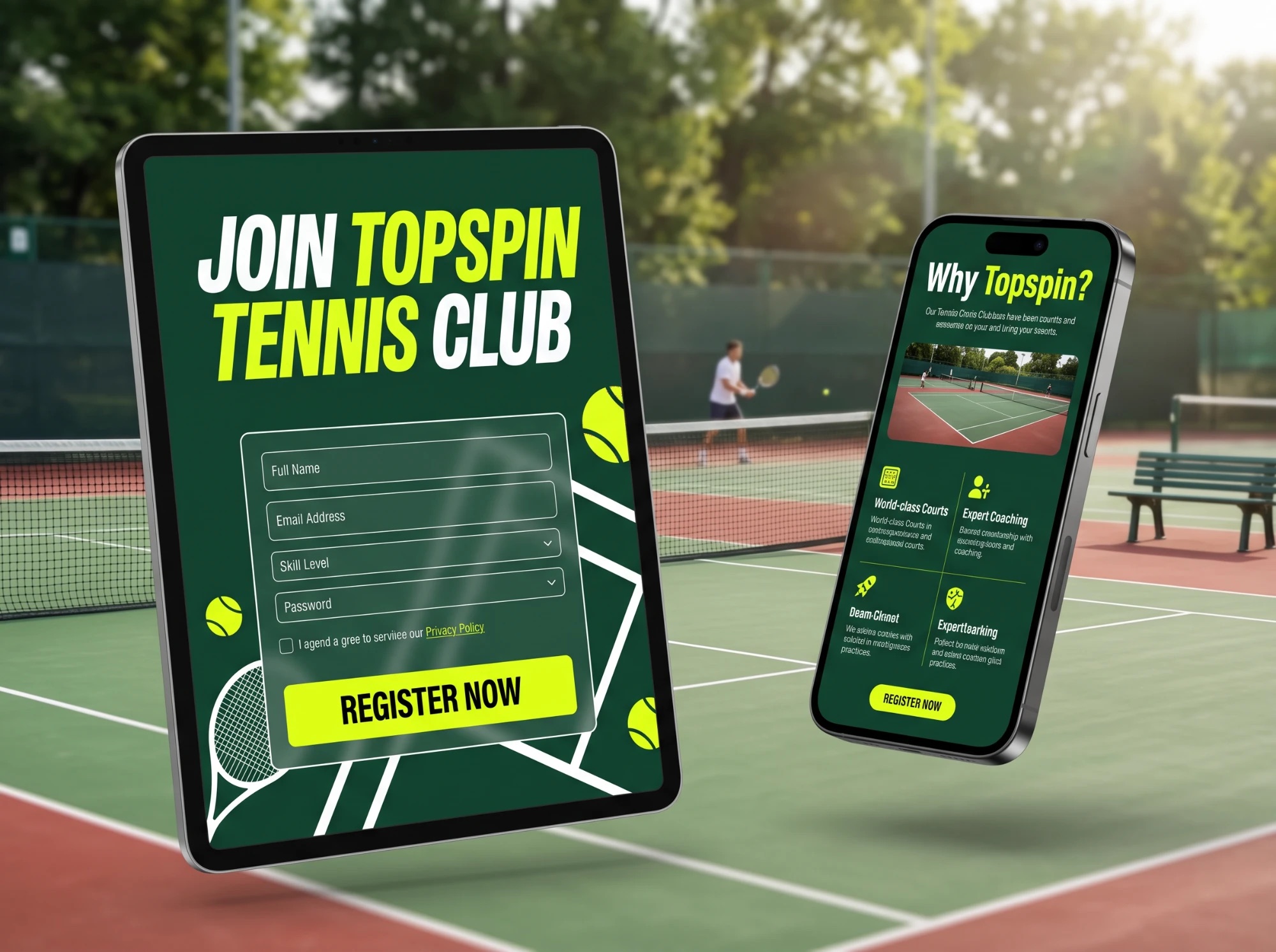
Every screen, on court
(03) — Mobile
Desktop to mobile
(Highlights)
What we shipped
- A colour system taken from the court itself
- Court lines as the layout grid
- Ball yellow reserved for the next action
- Booking, membership and events in one flow
- Designed for desktop, tablet and phone