Project 03 / 07
AYAA
- Client
- Asian Youth Artists Association
- Category
- Nonprofit website · Brand refresh
- Services
- Brand identity, UI/UX, Web
- Stack
- HTML, CSS, JS
- Year
- 2026
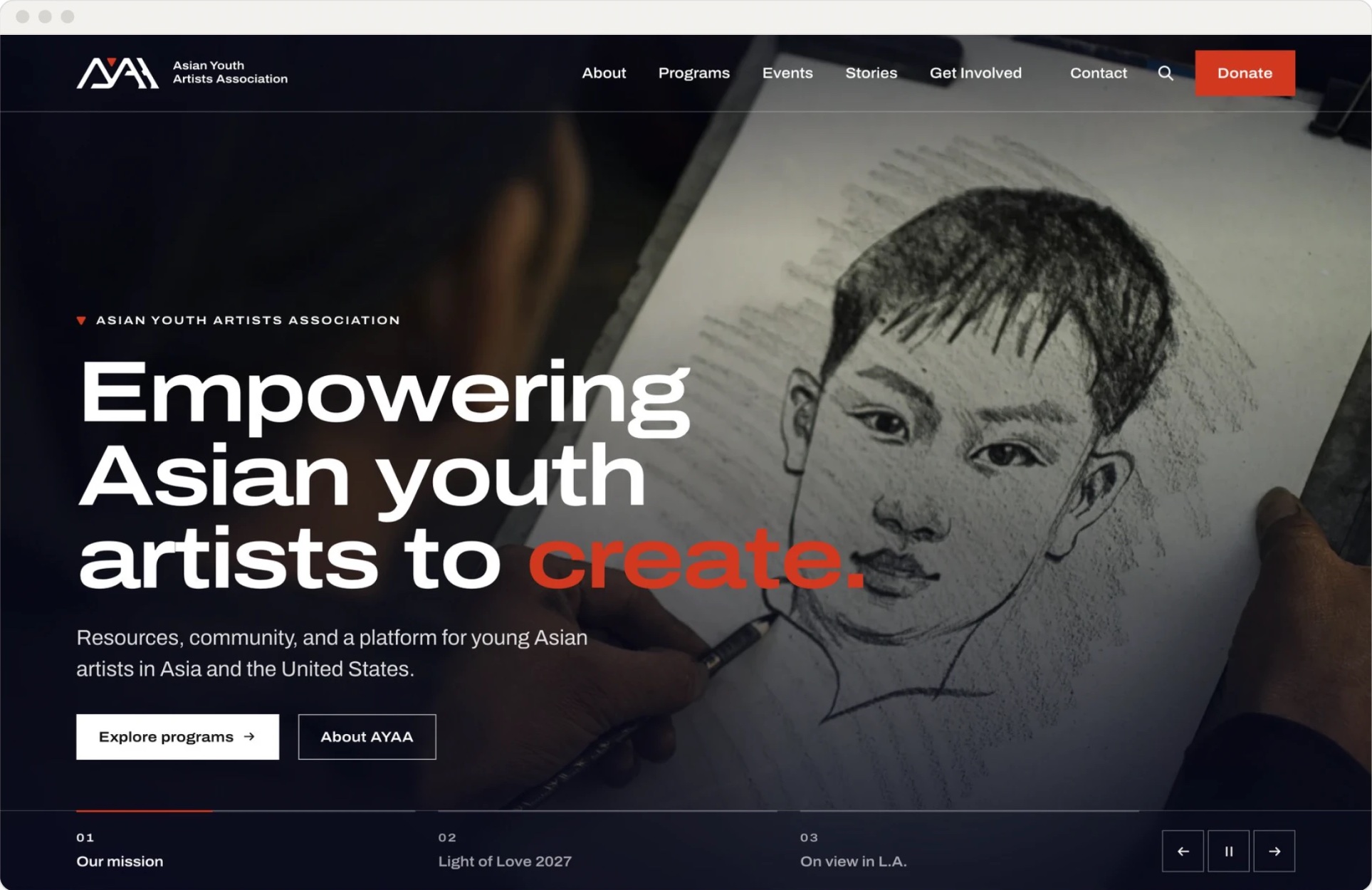
A new website and a sharper brand for a nonprofit supporting young Asian artists in Asia and the U.S.
(Brief)
Nine scattered menu items, no colour system, and a logo used the same way everywhere.
(Solution)
Keep the logo, find its strongest shape, and build a calm, museum-like site around it.
(01) — Logo
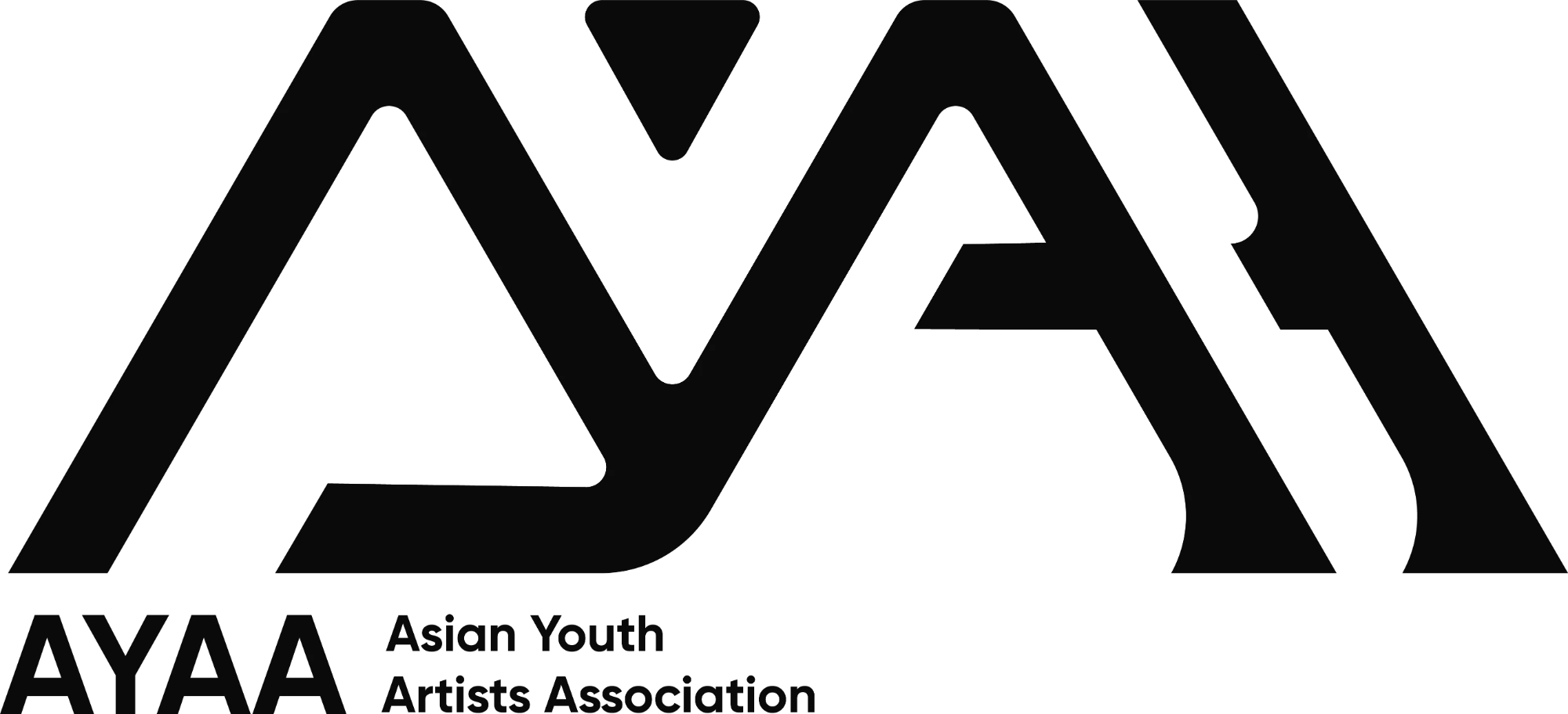
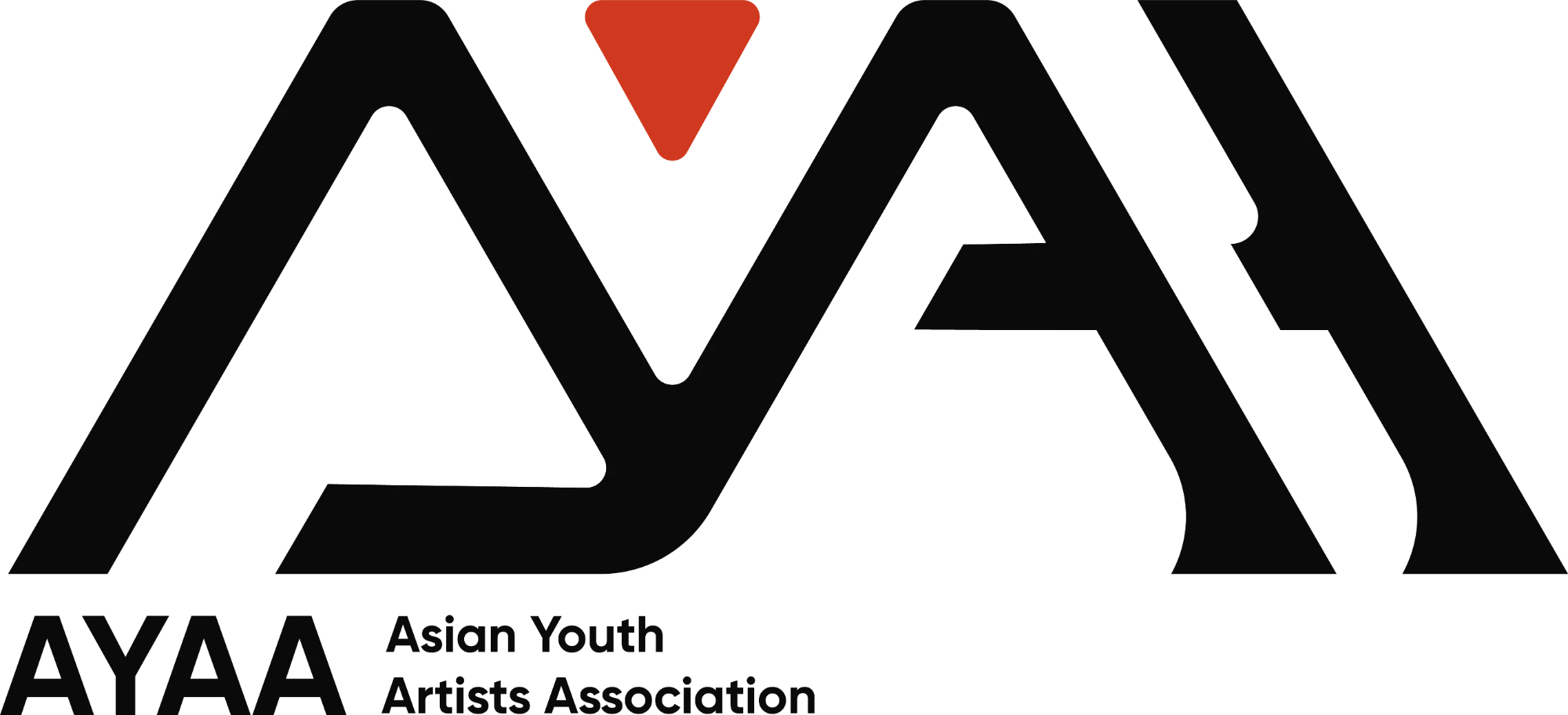
Before → After

(02) — Mark
From logo to mark
The inverted triangle was already in the logo. We lifted it out and made it AYAA’s own icon.
- Arrow
- Points down and onward: read on, click next.
- Seal
- Like the red seal an artist stamps on finished work.
- Recognition
- No full logo needed: the red triangle alone says AYAA.
(03) — Where the mark lives
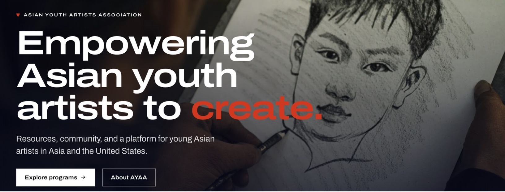
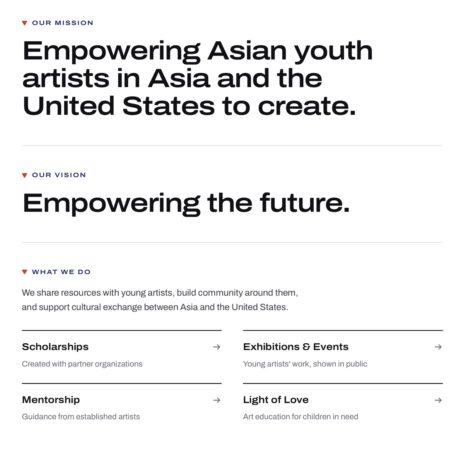
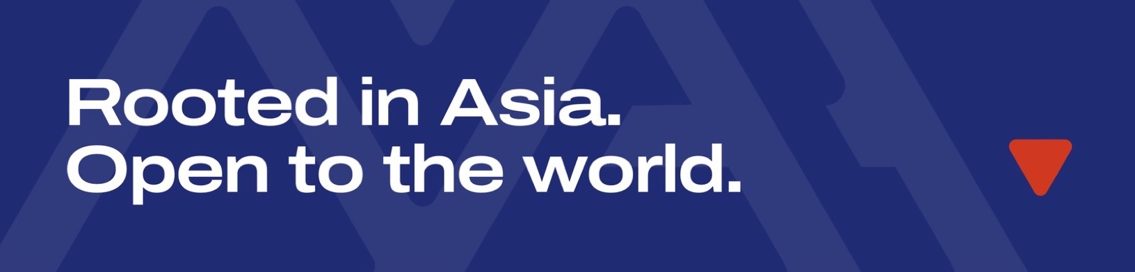
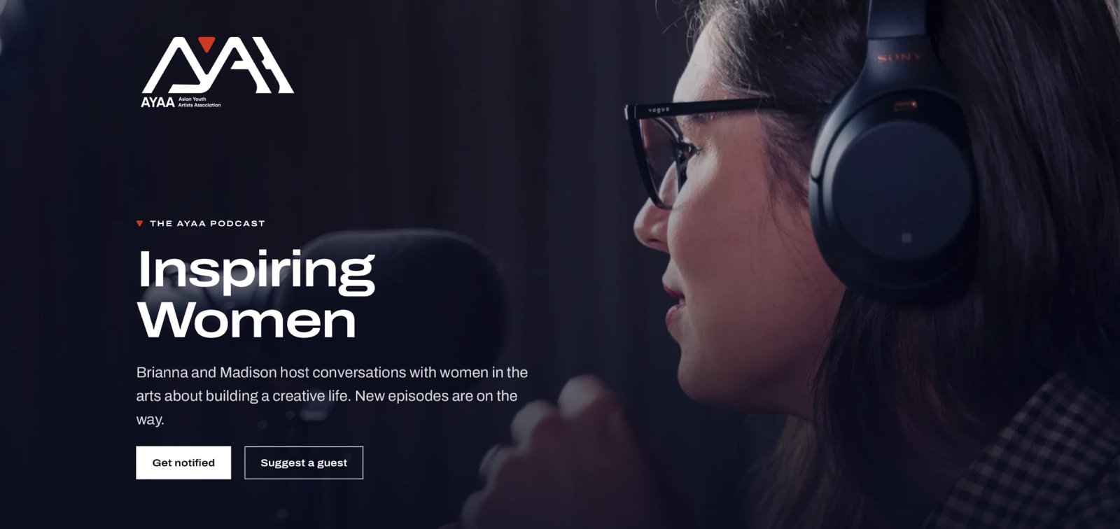
(04) — Colour
Two pigments of Asia
Primary
-
Indigo#1F2C737%
Aizome, blue-and-white cloth, batik. It gives the site an institution’s calm.7% · Feature panels, labels
-
Vermilion#D0381F3%
Seal paste, lacquer, torii gates. An artist’s signature: a point, never a field.3% · Donate, the mark
Neutral
-
White#FFFFFF60%
60% · Background, the gallery wall
-
Ink#11111418%
18% · Text, logo, footer
-
Wash#F2F1EE12%
12% · Alternate sections
Pill length = share of each page
(05) — Typography
One family, two widths
Primary typeface
Archivo Expanded
Width 125 · Weight 640 · Headlines, labels, buttons
Secondary typeface
Archivo
Width 100 · Weight 400 · Body copy, captions
One free, self-hosted family. Headlines use the expanded width to echo the logo’s wide, angular letters.
(06) — The final output
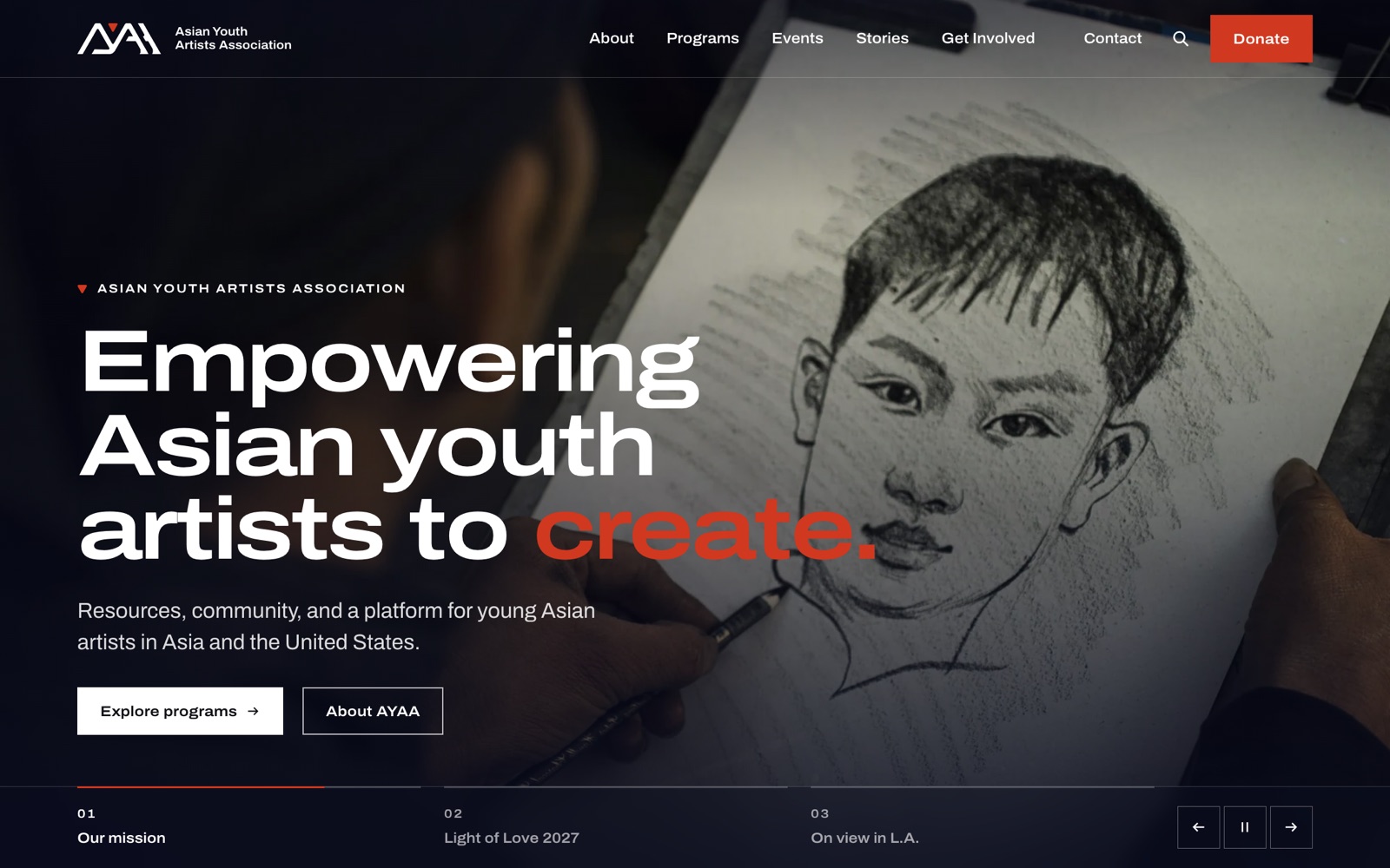
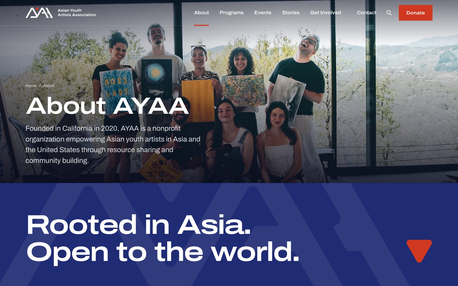
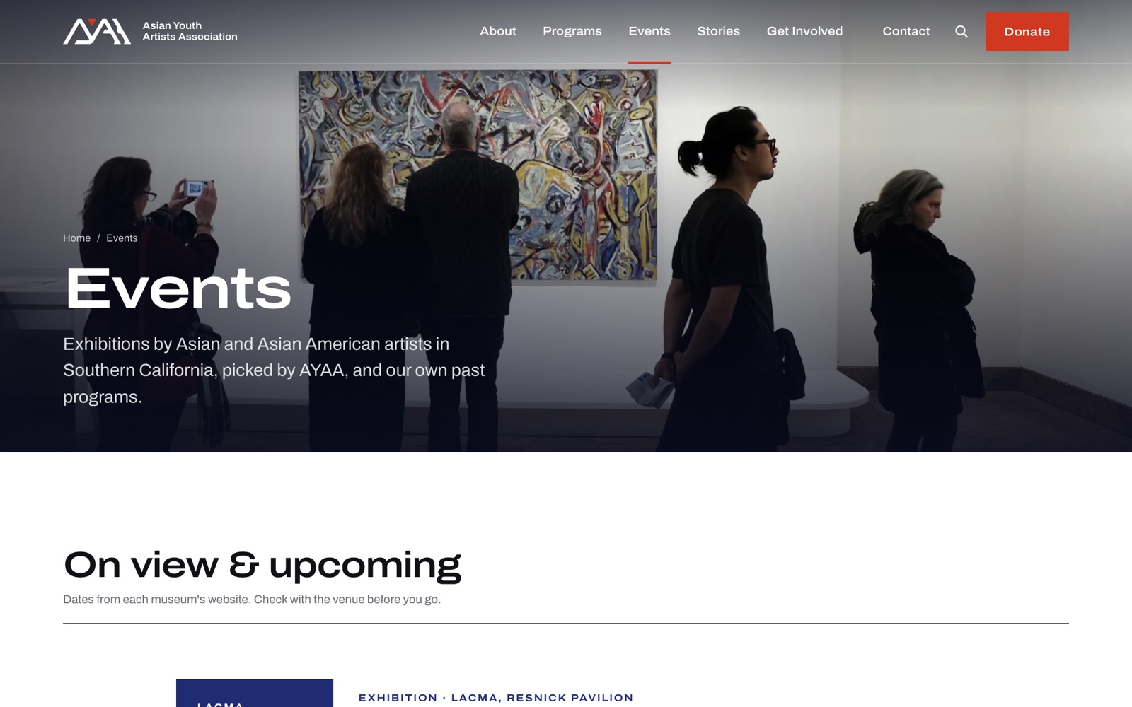
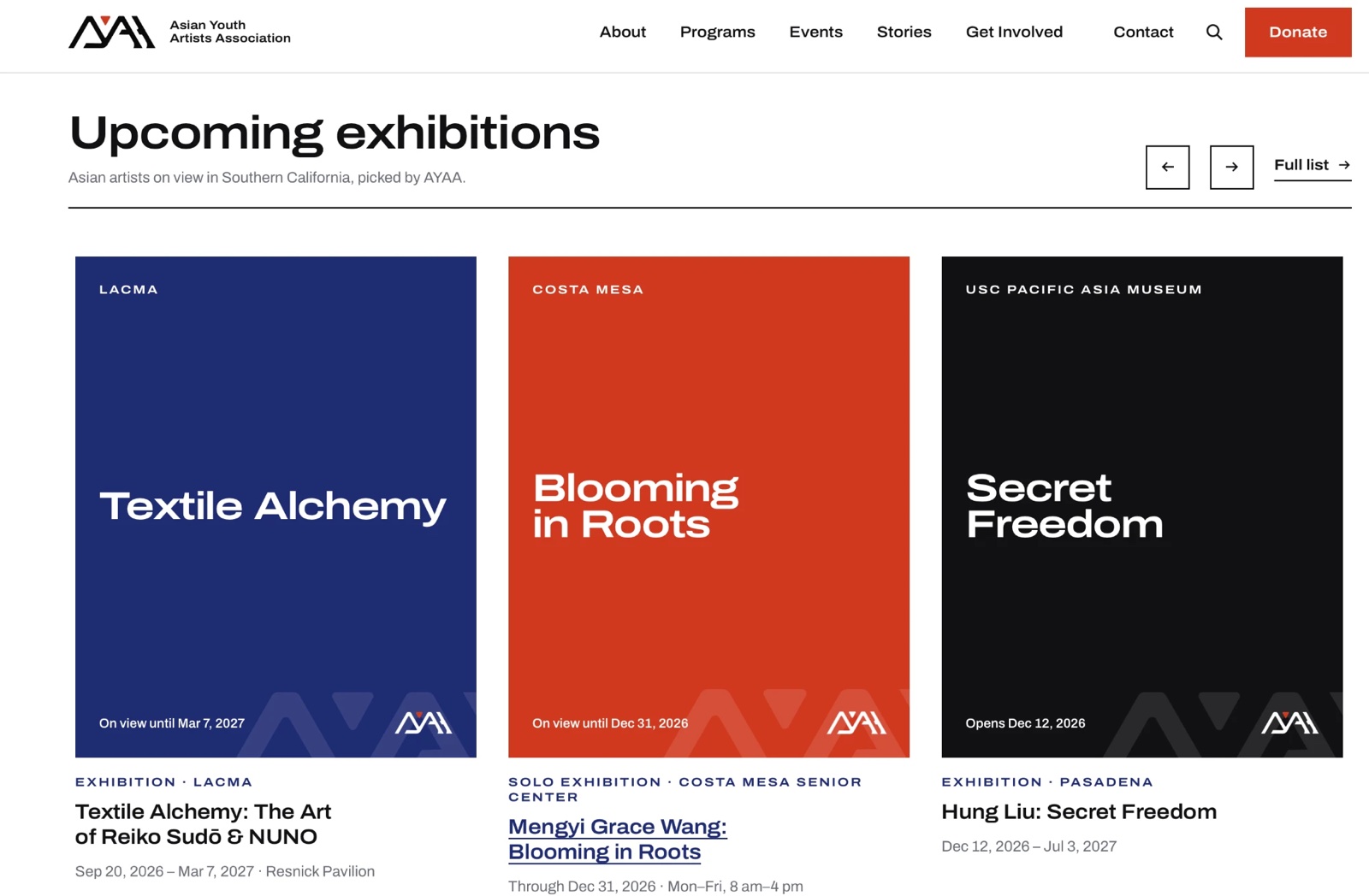
Every page, on brand
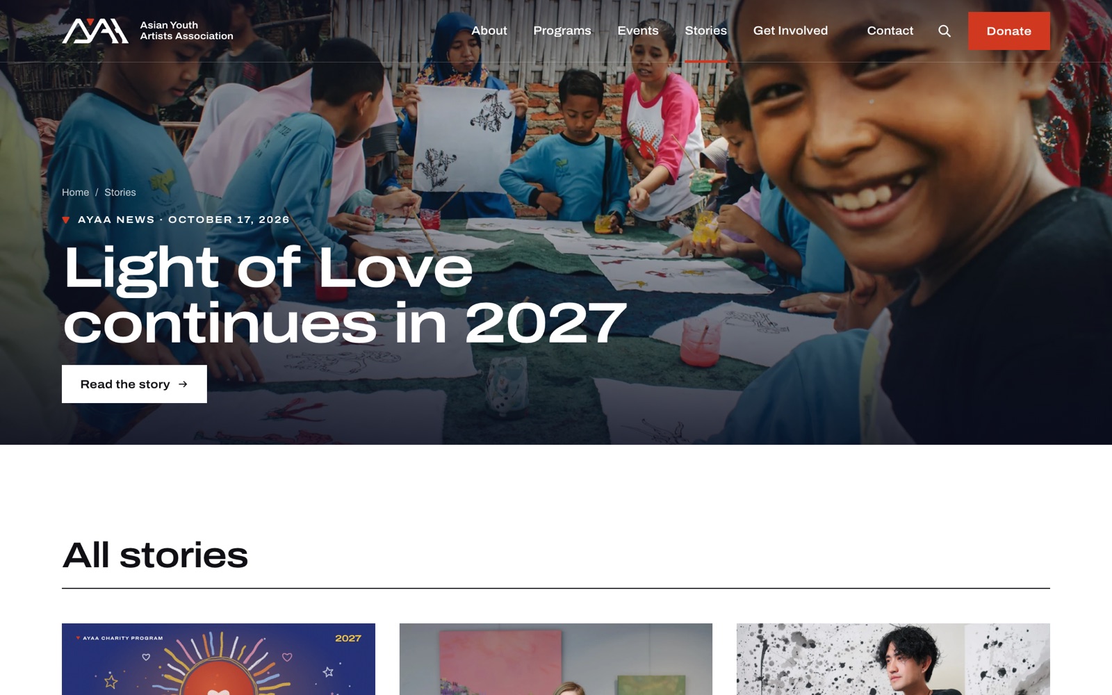
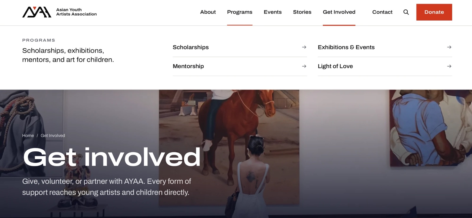
(07) — Mobile
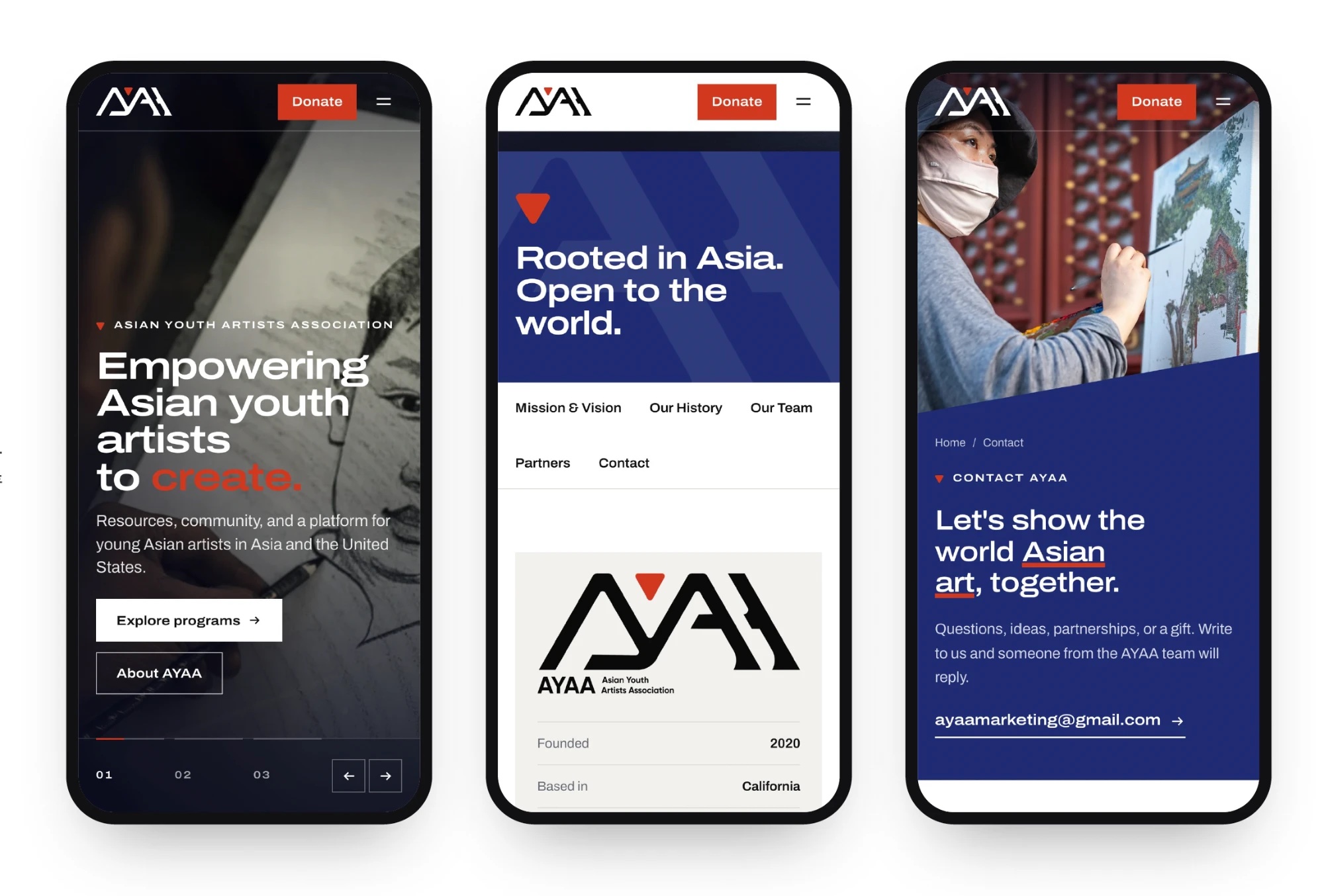
Desktop to mobile
(Highlights)
What we shipped
- From logo to mark: a signature icon drawn from the original
- A two-pigment colour system shared across Asia
- Nine menu items simplified to five sections + Donate
- Built for desktop and mobile